How to Implement Dark Mode in Next.js
This tutorial will show you how to implement dark mode in a Next.js project.

The dark/light mode feature has become ubiquitous in mobile apps and websites. To be able to choose how you view and interact with software has therefore become a must. If you are like me however, you just want to enjoy the novel feeling of having added something new to your personal project. Either way, this tutorial will show you how to implement dark mode in a Next.js project.
Requirements
To start, you only need to make sure you have npm installed.
Steps
Open up a terminal, and create a Next.js project using the following command:
npx create-next-app@latest next-app
Change directory .
cd next-app
Now we need to install next-themes, which will add support for color themes to the app.
npm i next-themes
Once the package is installed, open up _app.js in you text editor and import the ThemeProvider component from next-themes.
import '@/styles/globals.css'
import { ThemeProvider } from 'next-themes'

export default function App({ Component, pageProps }) {
  return (
    <Component {...pageProps} />
    )
}
Then add the component to the render function likeso:
import '@/styles/globals.css'
import { ThemeProvider } from 'next-themes'

export default function App({ Component, pageProps }) {
  return (
    <ThemeProvider>
      <Component {...pageProps} />
    </ThemeProvider>
  )
}
Now replace the code in ./pages/index.js with this code:
export default function Home() {
  return (
    <>
      <h1>The Next.js App</h1>
      <div className='button_container'>
        <button className='light_button'>Light Mode</button>
        <button className='dark_button'>Dark Mode</button>
      </div>
    </>
  )
}
Replace the code in ./styles/global.css with this:
body {
  height: 100vh;
  display: flex;
  align-items: center;
  justify-content: center;
  font-family: ui-monospace, Menlo, Monaco, 'Cascadia Mono', 'Segoe UI Mono',
    'Roboto Mono', 'Oxygen Mono', 'Ubuntu Monospace', 'Source Code Pro',
    'Fira Mono', 'Droid Sans Mono', 'Courier New', monospace;
}

h1 {
  font-size: 3rem;
  background-image: linear-gradient(45deg, #ab78f3, #42af90);
  background-size: 100%;
  -webkit-background-clip: text;
  -moz-background-clip: text;
  -webkit-text-fill-color: transparent;
  -moz-text-fill-color: transparent;
}

.button_container {
  display: flex;
  justify-content: space-around;
  margin-top: 20%;
}

button {
  border: none;
  border-radius: 3px;
  width: 45%;
  height: 40px;
  font-size: 1rem;
}

button:hover {
  cursor: pointer;
}

.light_button {
  background-color: #fff;
  color:#000
}

.dark_button {
  background-color: #000;
  color: #fff;
}
Test the app by running the following command in the terminal:
npm run dev
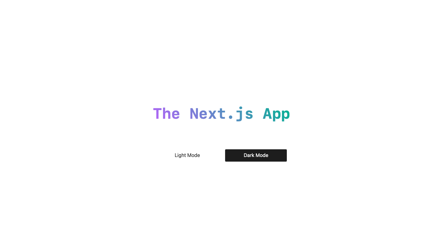
You should see something like this:

Now comes the part where we make the two buttons functional, and have them change the color theme when pressed. We first need to import a hook called useTheme from next-themes, and then use it to update theme when either of the buttons are clicked. Add this to your index.js file:
import { useTheme } from 'next-themes' //import the useTheme hook

export default function Home() {
  const {theme, setTheme} = useTheme();

  return (
    <>
      <h1>The Next.js App</h1>
      <div className='button_container'>
        <button className='light_button' onClick={()=> setTheme('light')}>Light Mode</button>
        <button className='dark_button' onClick={()=> setTheme('dark')}>Dark Mode</button>
      </div>
    </>
  )
}
Notice we declared a variable, "theme", from useTheme to have access to the the website theme in the Home components. We also declared a function, "setTheme", which we will use to in the onClick function of the buttons.
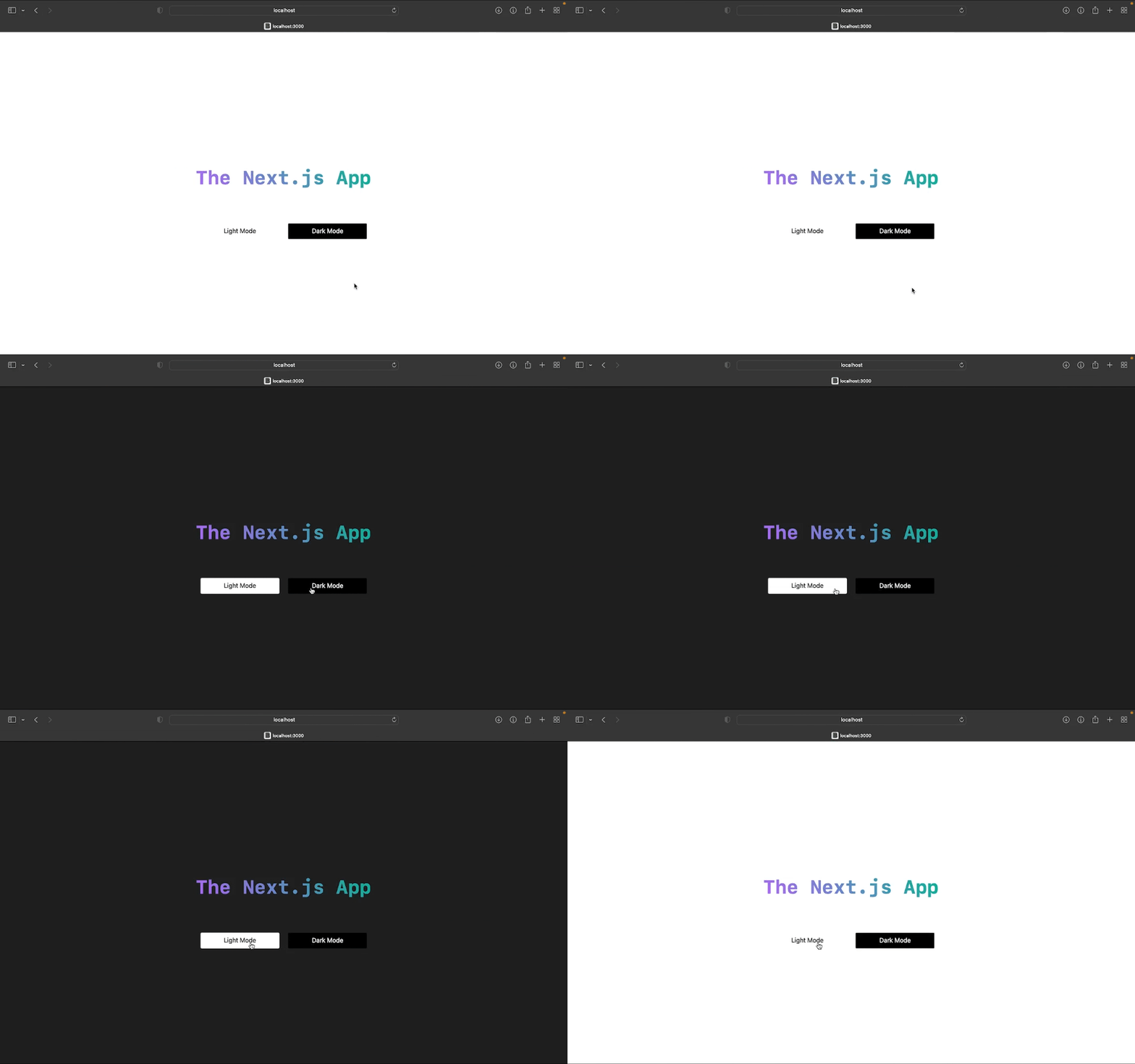
Save and check the changes in your browser.

The buttons work, and the theme changes now. But maybe we want to configure how other elements react to the theme change. For starters we can try making the background of the dark button blend with that of the whole page. Let us set the dark background color to a fixed value, and use that value as the button's background color also. In global.css, add the following lines:
:root {
  --background: white;
}

[data-theme="dark"] {
  --background: #1d1d1d;
}

body {
...
[data-theme="dark"] allows us use defined CSS properties and variables only when the theme of the website is "dark". Now in the body element we will use the --background variable to set the background color.
body {
  ...
  background-color: var(--background);
}
In the same file, set the background-color property of the dark button to #1d1d1d. Notice, we are not using the variable --background, as we don't necessarily want the button color to change when the theme changes.
.dark_button {
  background-color: #1d1d1d;
  color: #fff;
}
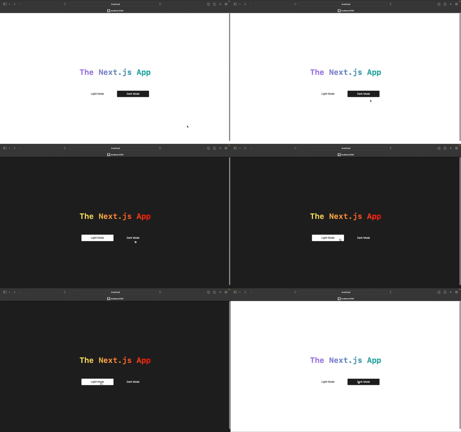
We can additionally utilize CSS variables to customize the color of the header too. Add these lines:
:root {
...
  --header-color: linear-gradient(45deg, #ab78f3, #42af90);
}

[data-theme="dark"] {
...
  --header-color: linear-gradient(45deg, #f3f378, #e32727);
}
...
h1 {
  background-image: var(--header-color);
...
}
...
And there we go!

Additional Notes
Suppose you want to do more than just create variables for different themes. You can instead create variants of CSS class and elements. In fact, we can achieve the same outcome without using variables.
/*:root {
  --background: white;
  --header-color: linear-gradient(45deg, #ab78f3, #42af90);
}

[data-theme="dark"] {
  --background: #1d1d1d;
  --header-color: linear-gradient(45deg, #f3f378, #e32727);
}
*/

body {
  height: 100vh;
  display: flex;
  align-items: center;
  justify-content: center;
  font-family: ui-monospace, Menlo, Monaco, 'Cascadia Mono', 'Segoe UI Mono',
    'Roboto Mono', 'Oxygen Mono', 'Ubuntu Monospace', 'Source Code Pro',
    'Fira Mono', 'Droid Sans Mono', 'Courier New', monospace;
  background-color: #fff;
}

[data-theme="dark"] body {
  background-color: #1d1d1d;
}
...
h1 {
  font-size: 3rem;
  background-image: linear-gradient(45deg, #ab78f3, #42af90);
  background-size: 100%;
  -webkit-background-clip: text;
  -moz-background-clip: text;
  -webkit-text-fill-color: transparent;
  -moz-text-fill-color: transparent;
}

[data-theme="dark"] h1 {
  background-image: linear-gradient(45deg, #f3f378, #e32727);
}
And that is all you need in order to implement dark mode into your Next.js app. You can have a look at the entire source code at this link.